Task Managing: Next Wave Technology
Overview
As organizations grow, it is increasingly important to rely on tools to help delegate and manage tasks as part of their workflow. Growing companies may start off with a manual system of task management with word of mouth and pen and paper to manage tasks. As small to medium sized teams grow and transition from this verbal form of management to a software version, they need help assigning tasks to teammates, tracking the progress of the task and projects, and helping everyone stay on the same page in the company.
Problem Statement
Create a task management tool that is used by an individual, team, or organization to help complete projects more efficiently by organizing and prioritizing related tasks.
Users and Audience
We chose to focus on small to medium size teams for this project. We focused on small organizations needing to stay on the same page with their many projects. Specifically, we focused on project managers who delegate tasks and individual workers who were assigned those tasks.
Roles and Responsibilities
We worked as a team of two. My job was to focus on the individual team members view. My partner worked on the project manager view. We were each able to create a few different supporting pages for both users that helped build our application out more. I chose the UI design and made adjustments based on user feedback.
Scope and Constraints
We had a little over a month to complete this project. A lot of the progress of this project fell to me as my partner has some life challenges occur during our project timeline. Our lack of experience was also a constraint.
Process
Research
Survey: We created a survey that included four different sections, demographics, team member experience, team lead experience, and task managing questions. 61% of individual contributor responses selected slow and inefficient processes as a challenge working on the team, making this the largest pain point identified. 62% of all responses (team lead - 75%; ind contributor - 56.5%) selected lack of communication as a major pain point for their current task management system. Another users said “That there never seems to be one system that meets my needs, so I find myself jumping between software solutions.” Another user said that “they would like it if their whole company used a task managing system so everyone knows what is going on and who is going on vacation and needs coverage.” Overall, our survey responses gave us informative information that helped us form our personas.
Current Product Research: We also performed product research, where we watched videos about the different task managing softwares such as Monday.com, Trello, Asana, and Jira. This helped us understand what is currently being offered in this field of work currently. It also helped us to see what was working and what was not.
Interviews: We were each able to perform interviews that further helped us understand what our users thought. Both of my interview people said that they think it is a waste of time to use a formalized software system. They think that it takes less time to actually just do the task, rather than write it down in the system, then have to update it every time an update occurs. One of my interviews did say that they used a word document to make a to do list, and that that worked great. Anther keeps a running list in his head. This does present an error of forgetting things, but if you stay up on your to do list it works fine, and you don’t waste as much time creating tickets and tasks in a software system.
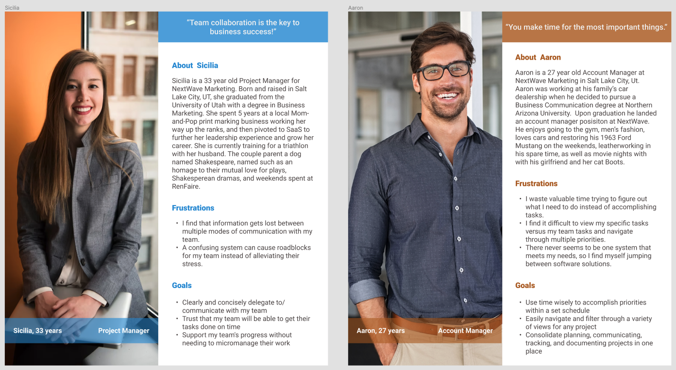
Personas
Data Analysis
After we performed all of our research, we gathered similar responses, grouped them, and created core goals that were similar, yet specific to a team leaders and individual team contributors. We were able to create a user flow, which then turned into our two personas. Some of our core themes included misuse of time, limited customizations, lack of platform integration, and uncomplicated systematic flows to eliminate any roadblocks for teams.
Site Map
Next we created a site map. Here we realized that there would be a lot of similarities between the two flows, one for the team manager, and the other for the individual contributor. We were also able to figure out some cross over pages that both lead and individual members would have access to. Then we started sketching our thoughts.
Framing
Sketching is an easy way to get your ideas down on paper. It is quick, easy, messy, but a brilliant place for ideas to take form. Some ideas have to be by other ideas to actual become a useful idea. Many sketches later, we decided we had a good grasp on the direction we wanted to go with our application, so we jumped into Figma to frame the rest.
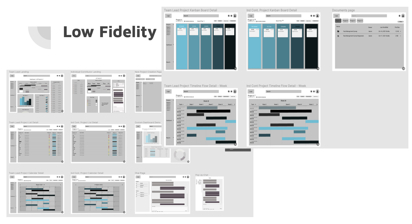
Low Fidelity mock ups translated our potential sketches to digital reality. We were able to lay parts of the web pages out, see how they would look and if we were going in the right direction. Thankfully we were, and we made sure that we were both keeping the users at the fore front of our designs. We started playing with the idea of color theory, and shapes and their associated meanings. We digitized the best part of our sketches and were able to communicate with each other to decide what was best for the user, or what we needed to change.
Usability Testing came next. I was able to interview two individuals that gave valuable feedback about the website. From my first interviewee, I learned that it was overall a good design, easy to navigate, and logical. There were a few issues with prototyping. My second interviewee suggested the use of bread crumbs for a quick visual reference when navigating through the different pages. They also pointed out the search bar was massive at the top of the page, eating up valuable space for something else, or for white space. They also questioned the menu bar on the left hand side of the page for task managers. With this feedback, I implemented the changes that would best support our users.
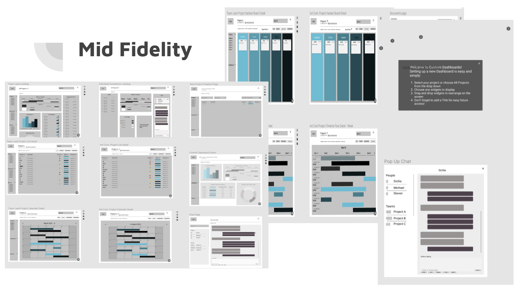
Mid-Fidelity mock ups came together quite easily. Implementing the changes to all of the pages took less time than I thought. We were then able to perform another usability testing session. Another interviewee pointed out that the priority symbols that we were using did not translate well. He didn’t know what they meant, and the colors were hard to see. He suggested something more universal, such as the exclamation point. He also suggested drill-able graphs that would help managers understand what the data was telling them.
Design Interface came next, I chose to go with a calming beach photo. My inspiration was to have something nice to look at while doing the necessary work. I also chose a picture that didn’t have crazy colors. I wanted to make sure that the user wasn’t overwhelmed with the amount of data that was being shown. I also chose to use cool colors for the tasks, pulling that pallet from the calming side of the color wheel. I also chose to do a frosted background box, so users would be able to see a little pop or color from the background, but be able to focus on the data of the task at hand. For the priority symbol colors, I used the color wheel to pull the complementary saturations of the typical red, yellow, and green. It was a challenge to get the right colors. Since there is a lot of information on display, I chose simple, easy to read fonts of Roboto for the text of the body, and Rosario for the headers. Raleway was also used for the category headers to add a little change, but not draw away from the information. And from that, our high fidelity web pages were created. Each little piece of the process created not only a website, but a product that I would use in my daily work life.
Outcomes and Lessons
In the end we were able to deliver a task management application for small to medium sized teams to use. It provides users with a plethora of ways to filter and view their tasks. It helps project managers track team and project progress, and eliminate roadblocks that are slowing team members down. If I were to manage a team, I think this would be an application that I would use because of the different views, but also the intuitiveness of the flow.
With each new challenge and project, I learn more and more. I would like to try different challenges and work in a team larger than three to see how that is. If we are all in charge of a part of the project, how do we mesh them together.
I also learned User Interface is a whole new world to me, and I would like to dive deeper with that and learn more there, specifically with color and business versus simplicity.
With this project specifically, if I had more time, I would go back and see if we have too many filtering options. I would create a complete work flow of a task for a project, from its origins to the completion status.
I also learned that you can “UX” anything. Most of my current job process could definitely benefit from a user experience point of view process. User Experience is looking at a situation and understanding the specifics of getting from point A to point B. The sign of a good designer, and who I wish to grow into, is knowing and understanding the analytics/details of the “hows and whys”, but also making visually beautiful and enjoyable products.


