On the Road: A Trip Itinerary App
Overview
There are two parts to traveling: the planning and the enjoying. Enjoying is the actual vacation, planning is the everything before. Travel industry is ever growing, and with that it can be hard to navigate and coordinate plans with friends. Itineraries are usually constructed via text message where important details can be lost and/or confusing. Up to date information can be miscommunicated causing headache and hassle while planning.
Better communication and scheduling outlines between travel members prior to trips, creates a more relaxing travel experience.
Our goal was to create a better mobile application to aid in the process of documenting trip itineraries while providing the most up-to-date data for all trip members. We specifically chose to focus on road trippers and state side travel due to the lower amount of variables associated with flying and international travel.
Roles and Responsibilities
Our team consisted of myself and two other junior designers, this being everyone’s first project. We shared equal responsibility in ideation and getting the ball rolling. We then branched out and did separate interviews, sketches, and low fidelity wireframes. We came back together, choosing the best parts of everyone’s designs, and used those to build the final application.
Scope and Constraints
Our team consisted of students who were new to design. Learning Sketch and Figma took some time which was hard to manage, as we only had 6 weeks to complete this task. We had to maintain a strict design schedule. Some weeks were easier than others while we were balancing the other responsibilities of life. The most challenging part of this project was working in a collaborative group. Articulating our thoughts that supported the designs was the most difficult challenge to overcome. We all had different ideas of how things should be designed and why they should be that way. Creating one cohesive app proved harder than I thought it should be.
The Process:
Research
Survey: One of the best ways to get information, fast from a large group of people, is a survey. Our design team received 66 responses back from our survey. The survey consisted of 15 questions spanning five categories: Demographic, Challenges, Behavior, Planning, and Outcomes.
“It’s just a simple list. I wish there was an app where I can also mark my locations and share my notes with my friends.” -Survey Response
Survey Results: The team’s survey returned a wide array of responses from specific answers to irrelevant answers. We asked for assistance in creating the “right” questions to ask in our survey. We did make a rookie mistake with one of our initial filtering questions. We asked “How many trips do you take in a year?” Our answer option included 0-3 trips, 3-5 trips, and 5+. It would have been helpful information if we would have had the options of 0 trips, 1-3 trips, 3-5 trips, and 6+. With the 0 trip option, then we could have filtered out responses that didn’t give us valuable information. This led us to perform interviews to get better information.
Interview: As a team we also chose to perform individual interviews. I was able to interview two people and bring back more specific information about our users to the team. This deeper information helped us connect with our users and find out specific reasons and suggestions that would help this application connect with its users in a realistic and applicable way. With the total information from six interviews, we worked on creating our personas.
Personas
As a team, we decided to create two personas because most of our survey and interview responses were split 50/50. We averaged our population’s age and assigned that age to our first persona. Then, we found the mode of our data set and assigned that to our second persona. We used the goals and frustrations from our survey and interview to shape our personas so we as designers could connect better with our users. We then chose three goals and frustrations to focus on for each persona, and thought it would be easier to address most of the challenges with overarching goals to create an easy to use, organized, helpful app for our users. Some of our persona’s goals included focusing on the collaborative efforts with other travelers, documenting travels, spending more time with family, creating peace of mind, being able to document favorite travel spots, and being able to look at event recommendations. Some of the frustrations included difficulty in organizing information, difficulty in sharing itineraries, not having shared specific travel locations with others, not having an easy to use app/product, navigation interruptions, and unexpected interferences causing trips to be postponed. After we collected all pieces of information, we found pictures, created named and biographies for our two users. The three overarching persona goals were: Create, Share, and Document. And that led us to story mapping.
Persona 1- Rachel
“There is nothing that Nature and Travel can’t fix.”
Persona 2- Erik
“Time is something you will never get back, spend it with those you love.”
User Story Mapping
With these three overarching goals, we continued next to the User Story Mapping. We brainstormed using digital sticky notes, in Miro, to hash out the “how” accomplishing our goals. This was a hard step to understand for me. I knew that the goals needed to have subgoals and ways to accomplish them, but I was struggling to know how to lay out the story map. One of my co-designer’s mentors gave us the suggestion of “don’t make it harder than it needs to be.” Once we simplified our approach, we were able to create a map that flowed through how the user would use the app.
Site Mapping
After we figured out our User Story Map, we created our site map. This displayed the flow that our users would take while using the app. This part was very exciting to me. Predicting user navigation can be a challenge, but filled me with great satisfaction when everything connected in the end.
Sketching
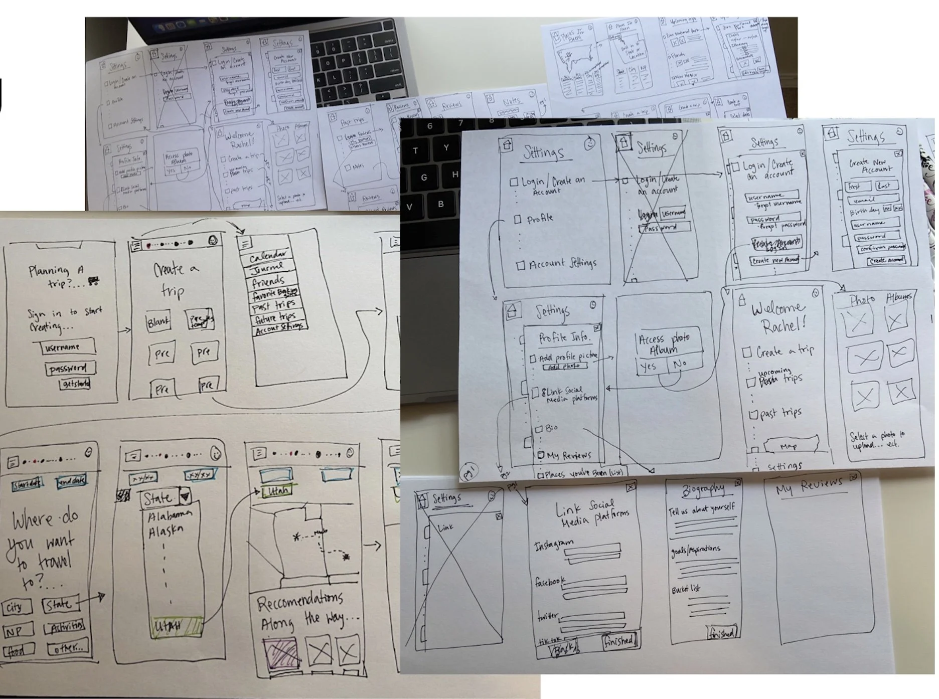
Next, we started sketching ideas. As a group, we decided to break away, draw/ideate, and then share our sketches. As we explained our ideas that we had drawn, we quickly began combining the best ideas from each sketch and our app started to take shape. I kept referring back to our personas to make sure we were staying on track for accomplishing our goals of create, share and document. After we decided on the final designs, we hopped into Sketch and started wire framing.
Wire Framing
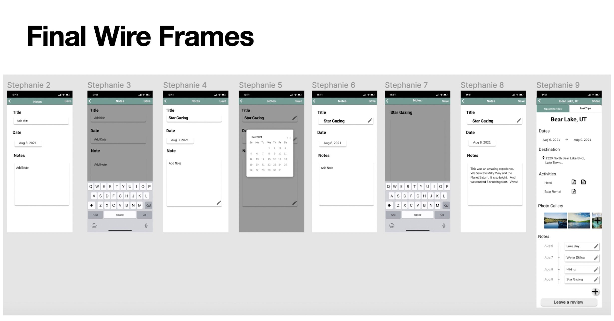
The software Sketch has a learning curve. It was a little difficult to learn a whole new software program, and be able to create something that reflected our thoughts for our app. I wasn’t able to spend as much time in Sketch as I wanted, but I am continuing to grow my knowledge base of that software. Once I spent some time in Sketch, we were able to create a low fidelity mock up of our app. On our mid fidelity and high fidelity frames, we transitioned into Figma which is a little more user friendly.
Testing
After each iteration of our wire frames, we were able to do usability testing. Users were able to click through a prototype to simulate a real itinerary app flow. Their mistakes were documented and brought back to the group for us to analyze and redesign. We were focused on creating an easy and intuitive application that helped users accomplish their task of itinerary planning. Testers were able to share their ideas and preferences to potentially include in the app. They also shared their wishes for the app which gave us insightful information that helped us design a more intuitive travel application.
Noted Struggles:
The prototyping clicks were a little weird.
The save and share buttons were not in an intuitive location.
The account pages were not intuitive.
Positive Comments:
The calendar ability to sync to their current calendar systems is a good idea.
They loved the bucket list feature.
They loved the collaborative features.
Results
In the end, we were able to create an Itinerary App that helped users accomplish their goals of creating an itinerary, sharing their plans, and documenting what they had planned/ did during their travels. With our final design review, I learned that it is very important to record what you do, or at least know why you made a certain decision. My decisions are my decisions, and as long as I can effectively communicate the why that decision was made, the better designer I will become. Supported decisions help designers know their designs better.
Outcomes and Lessons
I learned a lot from this first project. This was my first opportunity to run through the complete user experience design process. I figured out that I was trying to over complicate user story maps. I learned that the process is relatively easy when you have a clear goal you are trying to accomplish. I learned that group collaboration is not always easy. I learned that sometimes more personas are not always necessary when they are displaying similar goals and frustrations in the end. You always learn a lot the first time you do anything, and I am excited to try my hand at another project to see what I was am still struggling with, and what knowledge I have solidified. Overall, I would say this project was successful and turned out well.


